Get a Free Quote
If you are interested in speaking with Logo Ladz about an upcoming project, there are a number of ways we can make that happen. Filling out the form would help us get the right person in touch with you, or you could give us a call.

Take Care Of Your Bills
For over 10 years we have diligently worked at saving our community members the most money possilbe. See how much you may save today quickly and with no obligation. The product creators reached us for a brand identity which didn’t exist. Our brand identity development experts gave life to a new and beautiful identity.
GET FREE CONSULTANCY

Making brands the best on the web
Logoladz is a USA based creative agency which helps businesses get their communication delivered to their audiences with our team of creative thinkers and strategists.
Let’s Work Together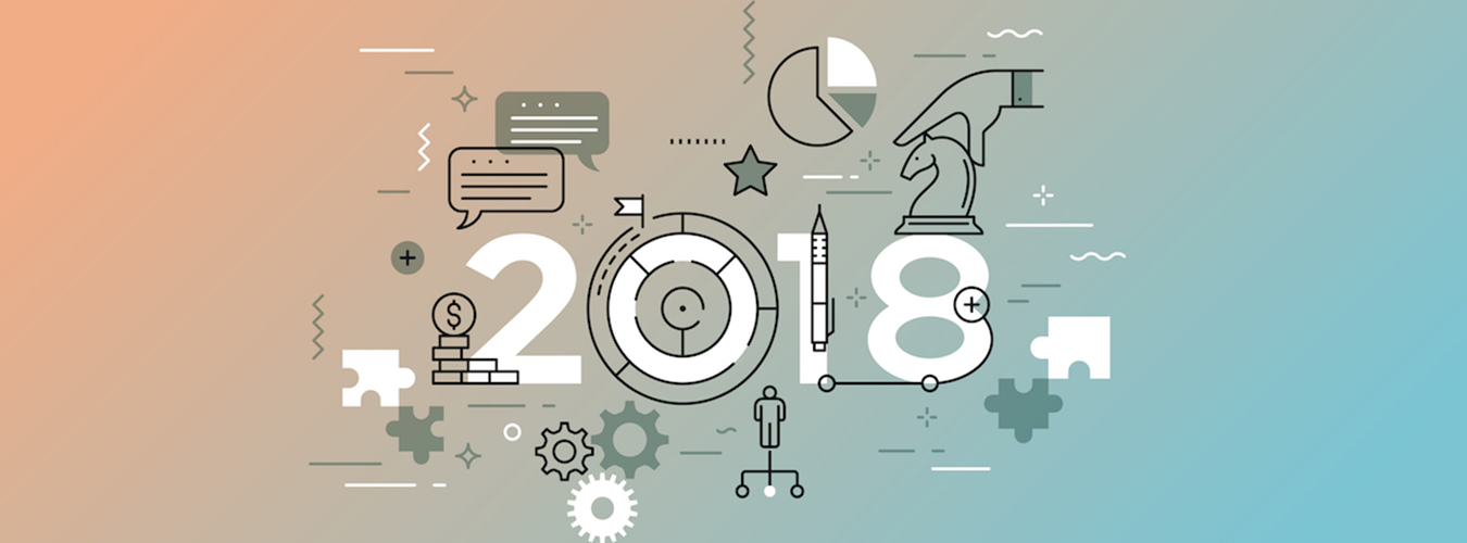
WHY HAVE GRADIENTS BECOME THE NEW DESIGN TREND
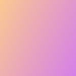
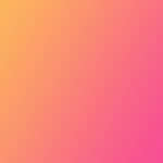
This year the color definition is amazingly being emphasized as the abstract approach of color blending is taking over the stage. Gradients are constructed from nature and with the help of an inspiration the theme speaks and define the campaign itself. This color evolution has created plenty of best logo design website with amazing texture and clear graphics. From user’s engagement to the purchase of the product through a website, every bit takes a new turn for the audience. Color style can start from bright to the lightest from left to right and lighter from the middle, either horizontally or vertically. There are no regular rules implemented, it can be styled from any corner or angel.
Gradients have made a huge comeback by stepping forward in the face of logos and other artwork where flat designs have evolved big time. So yeah! Gradients are rocking the graphics. Colors play a major part in building up with the emotions, these senses can understand the color themes and may enable the mind to understand the trending objective. Logo designers are being influenced immensely lately by the evolving trends of flat designs and color scheming. This shift of color theme from one tone to the implementation of gradients is meaningful. These gradients are used in UI and web illustrations.
This beautiful and peculiar transition of colors are synthetically defined and compliments the present tones in it. If the site consists of minimum graphics than gradient effects are beautifully blended.
BACKGROUND GRADIENT DEPTHS
With the comeback of background depths, the more gradients are becoming designer’s favorite. The combination of flat design and gradient effect is giving a new dimension to the brand. This concept is sleek and chic, the campaigns are now more vigilantly working by keeping these new year trends in mind. The gradients display more shadows and a natural color transition to the content.
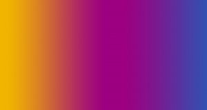
DUOTONE GRADIENT
The combination of doubled toned with gradient effect is on it wind. Its no doubt a perfect fit for enhanced graphic designing. This concept is creating an influence in graphic designing world. Many designers are developing their own gradient patterns by using more pinks, greens and peaches.
This style is fresh and unique as the fade crossing effect is something very trendy and new. Instagram has taken the gradient effectively, so pinks and lighter tones are now taken, whereas twitter has reserved the lighter blue on a flat design. Try to come up with something out of the box.
GRADIENTS ARE UNFORGETTABLE
Logos with gradient effects are easy to memorize and are way catchier than one colored themes or logos. It is easily identifiable amongst other logos due to its gradient features. Colors can define the theme of a brand and the perception exceptionally. You can mix the color to form a gradient effect that could enlighten the campaign well. There are number of colors that are just defined in a way that every logo is comprised to adopt the same, however in gradients you can always add or subtract some mix and match of a color. For e: g: with a little tone of blue and some purple can create a blended effect from fade in to fade out.
With the colors that are already taken by the biggest brands has not left others with a choice than to combine some shades in obtaining the true color. That’s the point where we need gradient to do the magic!
GRADIENTS ARE REAL
Logos with gradient effects are easy to memorize and are way catchier than one colored themes or logos. It is easily identifiable amongst other logos due to its gradient features. Colors can define the theme of a brand and the perception exceptionally. You can mix the color to form a gradient effect that could enlighten the campaign well. There are number of colors that are just defined in a way that every logo is comprised to adopt the same, however in gradients you can always add or subtract some mix and match of a color. For e: g: with a little tone of blue and some purple can create a blended effect from fade in to fade out.
With the colors that are already taken by the biggest brands has not left others with a choice than to combine some shades in obtaining the true color. That’s the point where we need gradient to do the magic!
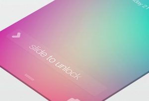
GRADIENTS FOR USER INTERFACE (UI)
Relatively large icons or logos with gradient effect is being popular amongst the users. Gradient subtlety and classiness is its identity, this displays the minimalism approach even in websites. Icons with small font or logos are difficult to merge in with gradient effect and can be distracting. When we talk about the user interface element the gradients must be attractive while making a logo for a brand. Instagram’s icon has taken away the waves and has grabbed many eyes. The color grading for logos must go with the trendy colors, however catchier for audience.
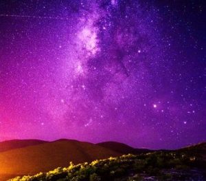
GRADIENT IS NATURAL
Through gradients every brand can build their identity and reputation. From these color scheming users can remember the brand’s name. The blend of colors in gradient effect seems real to the eyes. Since the concept is playful this is the reason why users get intact to the potential colors. The effect might not make the audience bore as it is a mixture of different colors that makes a single color into faded tones. With the age of digitization gradients are the best thing that ever happened to the marketing world. The color effect is real and can attract more human minds.
Gradients have become eminent in making a brand hit and has gained much popularity in the digital world. The objects and logos become more creative and innovative when right color is affiliated with gradient effect than it is much fun to depict the user with their related intentions. It is human’s nature that our minds get attached or catches more colors since the inception. With the growing print media, the gradients are also considered to be a right choice for onscreen advertisements, this whimsical effect has proven to be the most innovative one as the transition of colors is amazing when done in a logo.
Back in year of 2013 the color pallet and grading were introduced with only 33 shades and the diversity was less, however with the gradient effect now there are multiple shades to be implied in making creative hoardings and logos. This gradient influence made its hits where many designers started to implement the blend of gradient effect with flat designs. This trend has taken over 2018 completely with flying colors. For a launch of a product, a brand must analyze the type of audience and the nature of a product, so that the color grading is synced aptly.
BASIC LOGO
- UNLIMITED Logo Design Concepts
- By 3 Designers
- UNLIMITED Revisions
- FREE Stationary Design Set
- UNLIMITED Logo Design Concepts
- By 3 Designers
- UNLIMITED Revisions
- FREE Stationary Design Set
